Minimalist Design for the Criteria Tab
The picture above is an example of minimalist design. It features an uncluttered and simplistic visual scheme that is almost relaxing to the eye and mind. Optional or unnecessary elements are removed. It focuses on only the bare essential elements – the essence of the building or room’s function. Notice there isn’t even a towel rack.
It’s not really for me – it reminds me too much of a concrete future dystopia that I’ve seen too many times in sci-fi movies. It also doesn’t look comfortable at all. But hey that’s just me; I could be wrong.
However when it comes to OBI report design, minimalist is the only way to go when it comes to the Criteria Tab. Whereas architecture and design are subjective, when it comes to keeping the criteria tab minimalist there is a strong, demonstrable benefit to this philosophy. It’s so important that this is the very first thing I look for when I am called in for a performance healthcheck review.
This post will take a quick look into why. Read the rest of this entry
Build Your Own Time Hierarchy
Every single BI system has a time/date/period/calendar hierarchy in it. If you use the BI Apps, it actually comes with 2 different tables for this purpose alone, along with a ton of OOB capability. However, when you are faced with a pure custom system from scratch, how do you build one? What does it look like? What sort of data should it have in it?
I’m going to lay out what a decent Time Hierarchy looks like from an OBI and data model perspective. From there I’ll then demonstrate how to actually build one yourself instead of relying on complex code. Along the way we’ll mix in some best practices and theory as well.
Your mileage may vary depending on the specifics of your system, but my goal is to make the design and building of your hierarchy take only 3 hours and last the lifetime of your project (or career). Read the rest of this entry
Bad BI Form
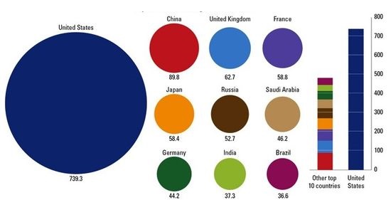
If you read Stephen Few’s work on BI Dashboards and visualization, you’ll recall that he says charts that rely on people to compare areas are not well suited to humans as we have trouble making the comparison. Circles are especially bad, and forget about fancy donut (circles with a hole) shaped charts.
This image is a perfect example of that. Can you really compare the big circle with the others, or even the others to each other? See how easy it is in the vertical bar comparison? Keep this in mind when dealing with comparisons using area based visuals.
HR Analytics at Wells Fargo – Project that won KPI Partners the Specialized Partner of the Year Award for BI and EPM
I’m very pleased to announce that the project I bled and sweated over for nearly a whole year has won KPI Partners the coveted Oracle Excellence Award for North American Specialized Partner of the Year in BI & EPM (formerly know as the Titan Award).
I led the KPI Partners team implementing HR Analytics from a PeopleSoft system for Wells Fargo, the worlds largest bank by Market Capitalization, with 300,000 employees and contractors. This is the largest footprint of HR Analytics in the world to date, both in terms of data volume and their ultimate # users planned- all 40,000 managers in the company!
Although the project was a difficult challenge, we were able to implement a BI solution the way I believe it should be implemented. A few key highlights below. For more information, please see the presentation HR Analytics at Wells Fargo from this year’s Oracle Open World, or KPI’s own page on the award.
2 Presentations @ Oracle Open World next week
I have two speaking slots next week at OOW in San Francisco – If you are there come by and see me – I don’t want to bring my suit up there for nothing!
The first one is the preso I’ve been giving this year on the Performance Layer for the BI Apps and custom solutions. Its part of an all day set of OBI sessions hosted by ODTUG on Sunday. My slot for UGF001 is at 2:20pm in Moscone West – Room 2007. It’s targeted towards architects but also managers who are looking for performance improvement options.
The second one is a new one, a case study for the world’s largest HR Analytics implementation I did a while back at Wells Fargo. There are a few key take-aways from the session, but in general its geared for customers considering purchasing and implementing HR Analytics. There is a sweet extra item about this project I cannot reveal this week, but rest assured it’ll be in the preso! The slot for CON5792 unfortunately is about the worst one possible – Thursday at 3:30 pm, Moscone South Room #302. I hope people haven’t left SF by then…
Jeff M.
The Single Most Important Thing to Know About the OBI RPD
Over my OBI career I’ve had to review dozens of customer and consultant developed RPDs as part of either a formalized health check engagement or simply a developer code review. Frequently the customer has some problems that they can’t solve, or that they have solved with a work-around of some sorts. In some cases this is simply due to not fully understanding the concepts and what you can do with those concepts, but sometimes there is something far worse at play: bad advice from supposed experts.
Twice this year I have come across customers who have been told by other “experts” that Dimensional Hierarchies aren’t that important or they should leave the Content tab empty. One of these so called experts was even an actual Oracle employee! This is disastrous advice as I will demonstrate in this post.
BI Apps / Performance Layer Preso
This is my presentation from last week’s Rittman-Mead BI Forum in Atlanta. Incidentally it happens to be the same topic (similar slides) to the KPI Partners webinar from April and what I gave in Denver at Collaborate also in April. The webinar has been recorded, so you can hear my commentary and the QA session afterwards. If you get the chance, I’ll be doing the same preso at Kscope in New Orelans next month. Enjoy!
KPI Partners Blog
I wanted to mention my company KPI Partners’ blog site at www.kpipartners.com/blog. Several of my collegues post articles there on a variety of topics in their expertise, plus its used as a vehicle for announcing a heavy does of webinars. In fact, I’m giving my BI Apps Performance Layer talk on Wed April 24th.
Please stop by and check it out, or even better yet – subscribe.
Jeff M.
OBI’s Nested Aggregation > Ralph Kimball
Ok so I put a provocative title on this post for a reason. This post will explore why some of Kimball’s concepts may be out dated when newer query generation or database capabilities are taken into account. Specifically, I’m going to discuss the OBI concept of Nested Aggregation, also known as Dimension Based Aggregation, in detail. Using this OBI Modeling technique you can relax a bit on one of the Kimball Dimensional Modeling rules. I’ll show how it works in a simplified manner, plus identify some things to be careful with and how it does not alleviate you from doing real modeling work. Read the rest of this entry
Testing Presentation from the 2013 BIWA Summit
I thought I’d post my presentation on QA (testing) that I delivered this week at the BIWA Summit near Oracle HQ in California. The preso is based off of the recent QA posts I did, with a bit more silly graphics on top of it. The one take away from the preso is that some people prefer the term testing as opposed to QA. Good to know. Anyway, enjoy!
KPI Run Your QA Cycles More Effectively
BTW, the event focused heavily on the future of BI and Data Warehousing. Essentially, whatever we are doing now is going to radically change to include many new types of data from different places and sources, plus what kinds of analysis we do will also be greatly enhanced. OBI is layering on top of a whole plethora of Oracle’s Analytical technologies, including: Essbase, EPM, HCM, OLAP, RTD, Endeca and R. The OBI server or UI will have hooks into just about everything you can think of, making some advanced capabilities available to dashboard users. We’ll see how it actually plays out, but in the future some pretty heavy stuff will be available in the dashboard.
Next up is a presentation on Performance Tuning the BI Apps which I’ll be delivering at KScope in June in New Orleans and Collaborate in April in Denver.


