Monthly Archives: September 2014
Minimalist Design for the Criteria Tab
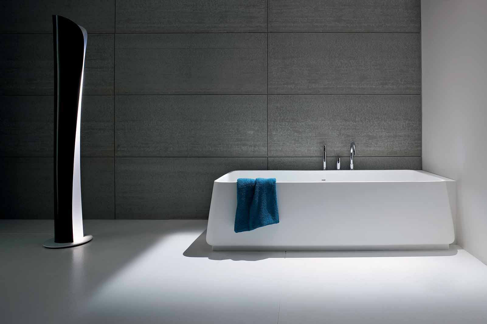
The picture above is an example of minimalist design. It features an uncluttered and simplistic visual scheme that is almost relaxing to the eye and mind. Optional or unnecessary elements are removed. It focuses on only the bare essential elements – the essence of the building or room’s function. Notice there isn’t even a towel rack.
It’s not really for me – it reminds me too much of a concrete future dystopia that I’ve seen too many times in sci-fi movies. It also doesn’t look comfortable at all. But hey that’s just me; I could be wrong.
However when it comes to OBI report design, minimalist is the only way to go when it comes to the Criteria Tab. Whereas architecture and design are subjective, when it comes to keeping the criteria tab minimalist there is a strong, demonstrable benefit to this philosophy. It’s so important that this is the very first thing I look for when I am called in for a performance healthcheck review.
This post will take a quick look into why. Read the rest of this entry
