Monthly Archives: October 2013
Bad BI Form
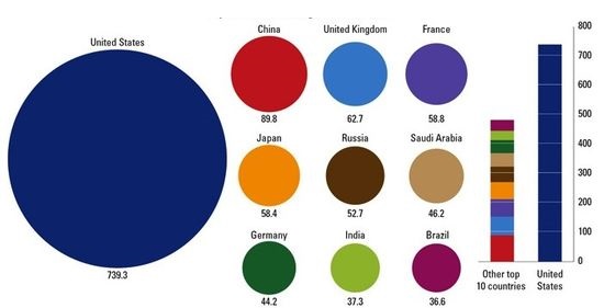
If you read Stephen Few’s work on BI Dashboards and visualization, you’ll recall that he says charts that rely on people to compare areas are not well suited to humans as we have trouble making the comparison. Circles are especially bad, and forget about fancy donut (circles with a hole) shaped charts.
This image is a perfect example of that. Can you really compare the big circle with the others, or even the others to each other? See how easy it is in the vertical bar comparison? Keep this in mind when dealing with comparisons using area based visuals.
